


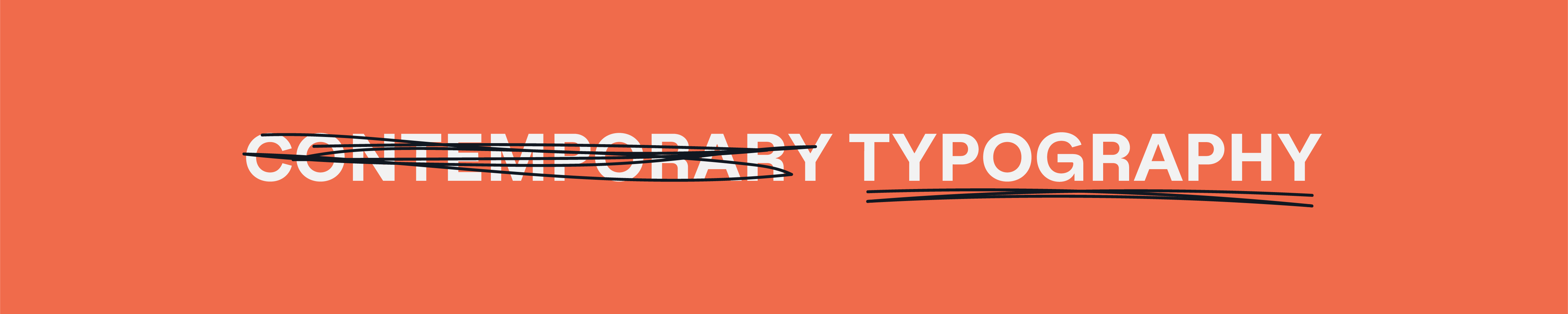
The Futility of Contemporary Typography.
The Futility of Contemporary Typography.
Too much noise!

Between my full time gig and freelancing in my spare time, much of my job consists of auditing, searching for new typefaces, and referencing typographers. I even keep a short list of my favorite foundries from France to New York City. The evolution of design in the digital era intrigues me and it’s something I am incredibly passionate about. So of course I can’t help but notice the trends within typography, the volume of new type foundries, and the difficulty of sifting through this ever-growing library.
As a “retired street artist” I’m ecstatic about the world of experimental type but what does it mean when the type itself isn’t legible? Can we still do our jobs as designers if clients and stakeholders can’t read what we intended? The concept of legibility is something I struggle with often. The question of whether my obsession is rooted in eurocentrism, or a rightful concern rooted in strategy and design thinking. In the digital world we can apply new techniques that weren’t possible with letter pressing and traditional forms of type design. Does that come at a cost? As we extend, condense, and bend letters to their limits we lose legibility, and ultimately shift further away from design and closer to art (the rant on the latter is for another day). I consider a vast majority of contemporary type to be useless. Massimo Vignelli once said that we only need 6 typefaces. I first heard the quote as a student 10 years ago and considered it bizarre and naive for a designer to make such a claim. Of course he was the naive one, not the egotistical 21 year old me. As years went on, and I progressed within my field, “what if he was right?” became the new question. What if all we need are 6 integral typefaces to stand above the fog within the world of digital? What if we could establish the new pillars of visual communication?
Occasionally my team depends on me to search for typefaces they can’t seem to find. Often (and sometimes to my surprise) a quick iCloud search leads me straight to the file they’re looking for. Across my 3 computers I probably have around 3200 typefaces installed. Condensed, geometric, serif, mono, sans, you name it and I probably have it. While I enjoy looking at the form of letters, the shoulders, counters, tails, and the overall integrity of each glyph. I find myself reusing a handful of typefaces across projects. Two of my personal favorites are Neue Haas Grotesk and Times New Roman, the magnum opus’ of Max Miedinger and Stanley Morison. I even used them in the branding/identity for my personal studio. And while a young emerging designer may consider these generic or old, I look at them like a vintage cabernet, or house built by stonemasons. They are typefaces that have stood the test of time and feel so present even in the digital age.
This newsletter will be full of run on sentences, the occasional typo, banter, and scattered rants from an ADHD driven graphic designer obsessed with his field. But it’s not a dumping ground or complaint-machine. I will never warrant a complaint without a resolution.
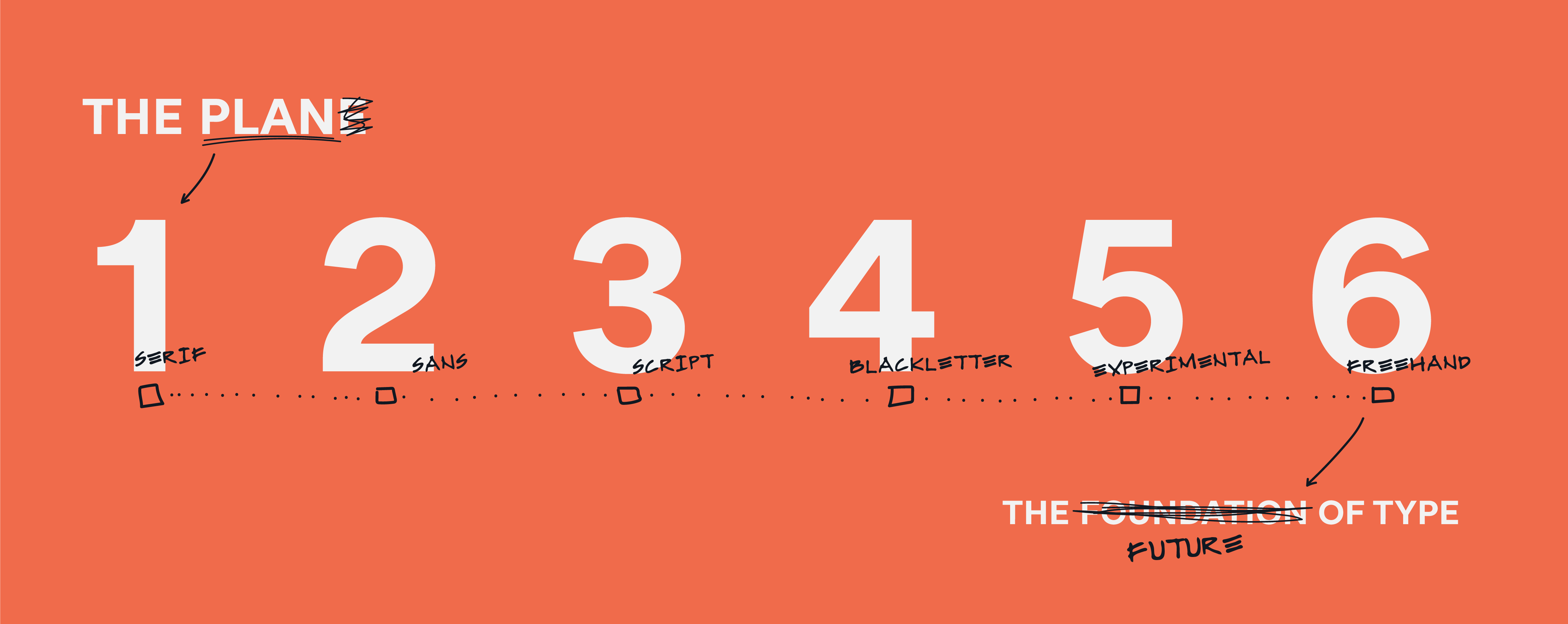
My proposal is that we as a generation of designers collect or assemble 6 typefaces that are inclusive of the past, present, and future. 6 typefaces that embody all of the ways we communicate with one another. A sans, a serif, a blackletter, an experimental, a script, and what I will refer to as a “freehand”. Something that’s not quite a script but far more legible than scribble (or my handwriting). I believe that establishing this order or “foundation” if you will, is one of the many approaches to evolve our practice and clear the fog. This will allow us to pay homage to the past, root ourselves in the present, and focus on the future
.